
A lot of healthcare website projects are already carrying risk before anyone opens Figma, writes a sitemap or talks about the CMS.
Not because the marketing team has done anything wrong.
Usually, they are responding to a real pressure.
The website looks dated. The business has changed. The content has become messy. The user journeys are unclear. The CMS is frustrating. A product launch, funding round, therapy-area push or internal restructure has created a need to improve the digital estate.
So the brief naturally starts with the visible output:
- “We need a new website.”
- “We need a better design.”
- “We need clearer navigation.”
- “We need improved user journeys.”
- “We need something easier to update.”
All reasonable aims.
But they are not always the right starting point.
The better starting point is:
What does this website need to make easier, clearer or more effective?
That sounds simple, but it changes the whole conversation.
The visible problem is rarely the whole problem
When a healthcare or life sciences organisation says its website needs improving, the obvious symptoms are usually easy to spot.
The design may look tired. The pages may feel cluttered. The content may have grown organically over several years. The navigation may reflect internal departments rather than user needs. The site may be slow to update or awkward to manage.
But those symptoms often point to deeper questions.
- Is the problem really design?
- Or is it positioning?
- Is it a content structure problem?
- Is it a search and discoverability problem?
- Is it a stakeholder alignment problem?
- Is it a platform problem?
- Is it that the business has grown, but the website still reflects an earlier stage of the organisation?
This is where many website briefs become too narrow too early.
They describe the thing that needs replacing, but not the problem the next version needs to solve.
That matters because a website project can be delivered very efficiently and still miss the point.
Only with better visuals.
Healthcare websites have to do more than look credible
In less regulated or less specialist sectors, a website can sometimes get away with being a polished shop window.
In healthcare, pharma, biotech and med-tech, the job is usually more complicated.
A website may need to support several different audiences at once:
- Prospective customers or partners.
- Healthcare professionals.
- Patients or carers.
- Investors.
- Internal teams.
- Medical, regulatory or compliance stakeholders.
- Recruitment audiences.
- Referral partners.
Each group may arrive with different levels of knowledge, urgency and scrutiny.
That means a healthcare website is rarely just a design exercise. It is a structure, content and decision-making exercise.
It has to help people find the right information, understand what the organisation does, trust the content, navigate the right route and take a sensible next step.
If that is not worked through before the brief is written, the project can quickly become a redesign of the existing confusion.
Only with better visuals.
The brief often starts too close to the output
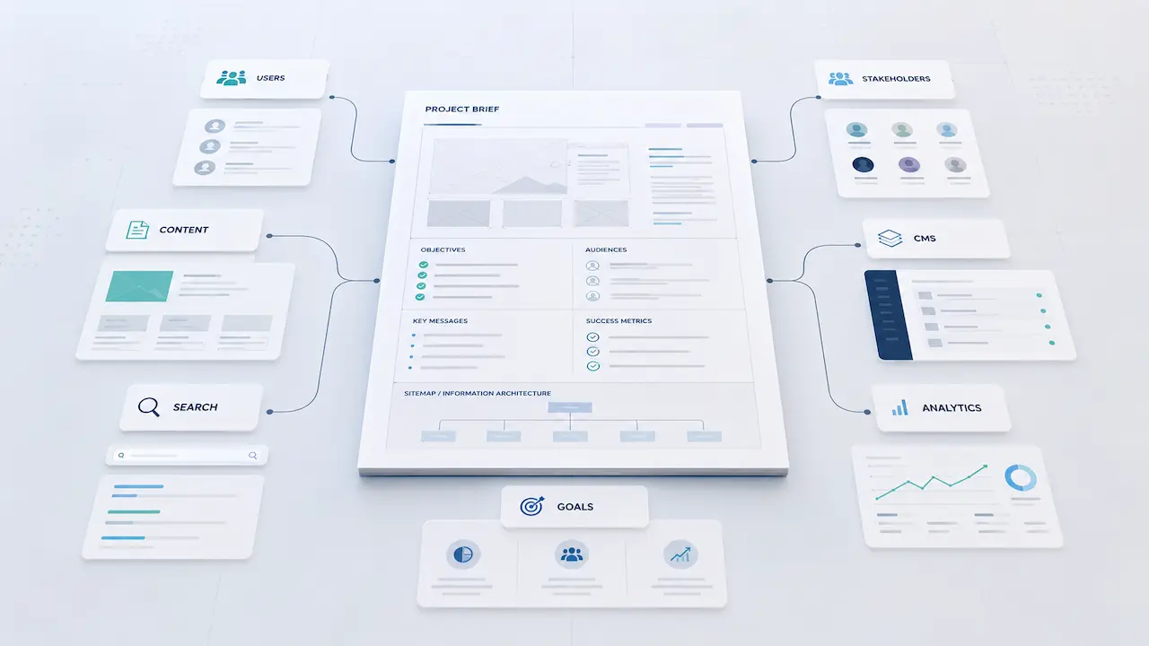
A common issue is that website briefs jump straight into deliverables.
- Number of pages.
- Preferred CMS.
- Design references.
- Required features.
- Timeline.
- Hosting.
- Integrations.
- Accessibility.
- Analytics.
All of those things matter. But they are easier to define once the core problem is clear.
Before asking what the new website should include, it is worth asking what has changed.
- Has the organisation entered a new commercial phase?
- Has the audience become more complex?
- Has the product or service offer changed?
- Is the site failing to support sales conversations?
- Are users struggling to find important information?
- Are internal teams avoiding updates because the CMS or approval process is too painful?
- Is content being added without a clear structure?
- Are search visibility and AI-era discoverability becoming more important?
- Is the website now part of a wider platform, portal or content ecosystem?
These questions are not academic. They shape the right solution.
Sometimes the answer is a better corporate website. Sometimes it is a clearer product or therapy-area content structure. Sometimes it is a gated environment, specialist tool, landing page system, technical clean-up, content model or integration.
And sometimes the first useful step is not design at all.
It is clarity.
A weak brief can make good suppliers look average
This is another uncomfortable truth.
If the brief is unclear, even a capable agency or digital partner can be pulled into the wrong conversation.
The client asks for pages, templates and features.
The supplier responds with pages, templates and features.
Everyone appears aligned.
But the more important questions remain unresolved:
- What is the website expected to change?
- Which audiences matter most?
- What does a good user journey actually mean in this context?
- What content needs to be easier to manage?
- What decisions are currently slowing the team down?
- What will make the website more useful after launch, not just more attractive on launch day?
Without that clarity, the project can become a production exercise rather than a strategic digital decision.
That is where the risk sits.
Not always in dramatic failure. More often in quiet underperformance.
A site goes live. It looks better. Stakeholders are relieved. Then, six months later, the same problems start to reappear.
The content is still hard to manage.
The structure still does not quite support the business.
The site still does not explain the organisation clearly enough.
The internal team still struggles to know where new content should live.
The redesign solved the visible problem, but not the underlying one.
Better briefs ask better questions
A stronger healthcare website brief does not need to be complicated.
But it does need to start with better questions.
For example:
- What commercial job does this website need to do?
- Who needs to trust this website, and why?
- What do users currently struggle to find, understand or act on?
- Which parts of the current website create the most internal friction?
- What content needs to change regularly?
- Which journeys matter most?
- Where does the website currently fail to support conversations with prospects, partners or stakeholders?
- What should be easier six months after launch?
- What should the website enable the organisation to do next?
That last question is often overlooked.
A good website is not only a better version of what exists today. It should also give the organisation a stronger base for what comes next.
That might mean clearer content governance. A more flexible page structure. Stronger search foundations. Better analytics. A cleaner route into product or therapy-area content. Easier campaign landing pages. Better separation of audiences. Or a platform that can support future tools, portals or integrations.
The right questions help define the right shape of the project.
Strategy before design is not a delay
This is where some teams get nervous.
They worry that more thinking at the start will slow the project down.
In reality, the opposite is often true.
Clearer thinking upfront can reduce rework, shorten decision loops and prevent the project from drifting once design and development begin.
- It gives internal stakeholders a shared frame of reference.
- It helps the agency or digital partner challenge assumptions constructively.
- It makes technical decisions easier.
- It makes content decisions less subjective.
- It gives the finished website a clearer reason to exist.
Strategy before design does not mean months of workshops, bloated documentation or digital theatre.
It means making sure the team has answered the questions that will materially affect the outcome.
For healthcare, pharma and life sciences teams, that matters because website projects rarely exist in a vacuum. They sit inside commercial goals, content needs, stakeholder expectations, technical constraints and sector-specific scrutiny.
The brief needs to reflect that reality.
The practical takeaway
If you are planning a new healthcare, pharma, biotech or med-tech website, do not start by asking what the new site should look like.
Start by asking what the current site is failing to make clear, easy or effective.
Then define the website around that.
The best briefs do not just describe the output.
They explain the problem, the audiences, the decisions, the constraints and the outcomes the project needs to support.
That is what gives design and development a better chance of solving the right problem.
What next?
 At Genetic Digital, we help healthcare, life sciences and pharma teams define the strategy, deliver websites, platforms and content experiences that are strategically sound, technically workable and fit for real-world regulated environments.
If your organisation is planning a website redesign, digital platform project or wider review of its digital estate, it is worth clarifying the direction before you commit to the build.
Our Digital Direction Review is designed to help healthcare and life sciences teams assess where they are now, identify what needs to change, and define a clearer route forward before complexity, cost and risk build up.
